My Bootstrap 4 Notes
These notes are from doing the Bootstrap 4 Tutorial: https://www.w3schools.com/bootstrap4/default.asp
Another resource that complements this one is: https://getbootstrap.com/docs/4.5/getting-started/introduction/
A fluid container
The .container-fluid class creates a responsive, full-width container. This container has 2 columns.
A fixed container
The .container class creates a responsive, fixed-width container.
Note that its width (max-width) will change on different screen sizes. col-lg breaks to 100% earlier than -sm when reducing screen size. The column class col is not responsive.
For more grid examples, see:
https://www.w3schools.com/bootstrap4/bootstrap_grid_examples.asp
Break points
Default break points for Bootstrap
| Window Size | Max Width | |
|---|---|---|
| xs | <576px | 100% |
| sm | ≥576px | 540px |
| md | ≥768px | 720px |
| lg | ≥992px | 960px |
| xl | ≥1200px | 1140px |
Some common Bootstrap classes
Note this is a table with class .table
| Class | Effect | Other parameters |
|---|---|---|
| p-3 | padding, 3rd size | |
| mx-3 | margin x-axis | |
| mt-3 | margin top | |
| bg-primary | background primary color | -dark |
| text-white | white text |
Responsive Containers
The max width of the container changes on different screen sizes/viewports.
Bootstrap Fonts, Headings, etc.
Bootstrap 4 uses a default font-size of 16px, and its line-height is 1.5. The default font-family is "Helvetica Neue", Helvetica, Arial, sans-serif.
In addition, all p elements have margin-top: 0 and margin-bottom: 1rem (16px by default).
h1 Bootstrap heading (2.5rem = 40px)
h2 Bootstrap heading (2rem = 32px)
h3 Bootstrap heading (1.75rem = 28px)
h4 Bootstrap heading (1.5rem = 24px)
h5 Bootstrap heading (1.25rem = 20px)
h6 Bootstrap heading (1rem = 16px)
ems and rems
From: Mozilla's MDN Web Docs
em and rem are the two relative lengths you are likely to encounter most frequently when sizing anything from boxes to text. It's worth understanding how these work, and the differences between them, especially when you start getting on to more complex subjects like styling text or CSS layout. The below example provides a demonstration.
The HTML is a set of nested lists — we have three lists in total and both examples have the same HTML. The only difference is that the first has a class of ems and the second a class of rems.
To start with, we set 16px as the font size on the <html> element.
To recap, the em unit means "my parent element's font-size" in the case of typography. The <li> elements inside the <ul> with a class of ems take their sizing from their parent. So each successive level of nesting gets progressively larger, as each has its font size set to 1.3em — 1.3 times its parent's font size.
To recap, the rem unit means "The root element's font-size". (rem stands for "root em".) The <li> elements inside the <ul> with a class of rems take their sizing from the root element (<html>). This means that each successive level of nesting does not keep getting larger.
However, if you change the <html> font-size in the CSS you will see that everything else changes relative to it — both rem- and em-sized text.
Display Headings
Display headings are used to stand out more than normal headings (larger font-size and lighter font-weight):
Display 1 (h1 class="display-1")
Display 2
Display 3
Display 4
Bootstrap Classes & Elements
Bootstrap has many many classes. See: https://www.w3schools.com/bootstrap4/bootstrap_ref_all_classes.asp
Some common ones:
.mx-auto .lead .small .text-left .text-break .text-monospace .text-nowrap .text-uppercase .list-unstyled .list-inline .text-info .text-light text-primary .toast .w-25 .font-weight-light .font-weight-lighter .font-weight-normal .text-sm-center
There are also many Bootstrap specific elements, such as:
                <mark>
                <blockquote>
                <dl>
                <dt>
                <code>
                <pre>
Overflow
Note: the class .text-break can be assigned to a parent div to keep a long URL text from overflowing and breaking the responsive layout
e.g. Thisisaverylongwordtoseewhathappenswhentheworddoesnotfitinthecontainingelement
Contextual Colors
Use the contextual classes to provide colors with classes to text or backgrounds. Note: default light gray background is #e9ecef (not #eee).
text-muted text-primary text-body text-light text-white bg-dark bg-primary ...
This text is muted.
This text is important.
This text indicates success.
This text represents some information.
This text represents a warning.
This text represents danger.
Secondary text.
This text is dark grey.
Default body color (on primary background).
This text is light grey (on information background).
This text is white (on dark background).
Bootstrap Tables
This table has the following classes within the table element or child elements:
table table-hover thead-light
The table is within a div with class: table-responsive
| First Name | Last Name | Type | Relationship | |
|---|---|---|---|---|
| John | Doe | john@example.com | Home | Friend |
| Mary | Moe | mary@example.com | Work | Aquaintance of mine |
| July | Dooley | july@example.com | Wrok | Guru |
Images
Some image classes:
rounded rounded-circle img-thumbnail float-right mx-auto d-block img-fluid
Note: mx-auto d-block are both needed to center an image. rounded-circle creates an oval.
So a custom class circle could be created with border 50% etc.
This is a Jumbotron
A jumbotron indicates a big grey box for calling extra attention to some special content or information.
Tip: Inside a jumbotron you can put nearly any valid HTML, including other Bootstrap elements/classes.
Alerts
Alerts are created with a div with the .alert class, followed by a contextual color classes. To close the alert message, add a .alert-dismissible class to the alert container. Then add class="close" and data-dismiss="alert" to a link or a button element (when you click on this the alert box will disappear, with classes fade show added for smooth transition). Note the button is the symbol × which can be made different sizes and weights.
Button Styles
Outline Styles
Button Sizes
Block Button
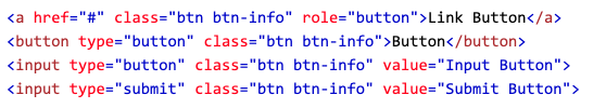
The button classes can be used on any of the elements: a button input
Button Elements
The button classes can be used on <a> <button> <input> elements.
Sample Code with 4 methods of using buttons.
Button States
Disabled LinkSpinner Buttons
Button Groups
See also vertical button groups.
Badges
Some sample badges:
Example heading New
Example heading 21
A pill badgeSuccess
Breadcrumbs
List Groups
Cards
This card has the .stretched-link class to a link inside the card, which makes the whole card clickable and hoverable (the card acts as a link).
https://www.w3schools.com/bootstrap4/bootstrap_cards.asp
The .card-columns class creates a masonry-like grid of cards (like pinterest). The layout will automatically adjust as you insert more cards. Note: The cards are displayed vertically on small screens (less than 576px).
Some text inside the first card
Some text inside the second card
Some text inside the third card, and this is what happens when one card has more text.
Some text inside the fourth card
Some text inside the fifth card
Some text inside the sixth card
The .card-deck class creates a grid of cards that are of equal height and width. The layout will automatically adjust as you insert more cards. Note: The cards are displayed vertically on small screens (less than 576px)
Some text inside the first card
Some text inside the second card, and this is what happens when one card has more text.
Some text inside the third card
Some text inside the fourth card
Dropdowns
A basic dropdown menu with a divider.
Simple Collapsible
Simple collapsibleAccordion Example
Note: The data-parent attribute makes sure that all collapsible elements under the specified parent will be closed when one of the collapsible item is shown.
Nav Pills
These are Toggleable / Dynamic Pills. Turn the nav menu into navigation pills with the nav nav-pills class. Much more on nav at: https://www.w3schools.com/bootstrap4/bootstrap_navs.asp
Home
Lorem ipsum dolor sit amet, consectetur adipisicing elit, sed do eiusmod tempor incididunt ut labore et dolore magna aliqua.
Bootstrap Forms
Several sections that cover: Default Seettings, Stacked Forms, Inline Forms, Layout Utilities, Form Rows and Grids, Form Validation.
https://https://www.w3schools.com/bootstrap4/bootstrap_forms.asp
Bootstrap Input
Bootstrap supports all the HTML5 input types: text, password, datetime, datetime-local, date, month, time, week, number, email, url, search, tel, and color. Note: Inputs will NOT be fully styled if their type is not properly declared!
Several sections that cover: Default Settings, Stacked Forms, Inline Forms, Layout Utilities, Form Rows and Grids, Form Validation.
https://www.w3schools.com/bootstrap4/bootstrap_forms_inputs.asp
Input Groups
The .input-group class is a container to enhance an input by adding an icon, text or a button in front (.input-group-prepend) or behind (.input-group-append) the input field as a "help text".
Use the .input-group-text class to style the specified help text.
Custom File
To create a custom file upload, wrap a container element with a class of .custom-file around the input with type="file". Then add the .custom-file-input to the file input:
Bootstrap Carousel
Modals
This is a modal with classes fade modal-lg modal-dialog-scrollable. Other sizes are sm xl and size not specified (medium)
Tooltips
Popovers
Click meToasts
A toast is like an alert box that is only shown for a couple of seconds when something happens (i.e. when a user clicks on a button, submits a form, etc.).
In this example, we use a button to show the toast message. I've added the class data-delay="2000". See also Get Bootstrap for more info.
Bootstrap Utilities
So many class parameters!
https://www.w3schools.com/bootstrap4/bootstrap_utilities.asp
Flexbox
Bootstrap 4 now uses flexbox, instead of floats, to handle the layout. The Flexible Box Layout Module, makes it easier to design flexible responsive layout structure without using float or positioning. Note: Flexbox is not supported in IE9 and earlier versions.
This is a broad subject. See: https://www.w3schools.com/bootstrap4/bootstrap_flex.asp
Media Objects
Bootstrap provides an easy way to align media objects (like images or videos) together with content. Media objects are often used to display blog comments, tweets and so on:
Create a media object with the .media .media-body classes:
John Doe Posted on February 19, 2016
Lorem ipsum dolor sit amet, consectetur adipiscing elit, sed do eiusmod tempor incididunt ut labore et dolore magna aliqua.
Lorem ipsum dolor sit amet, consectetuer adipiscing elit, sed diam nonummy nibh euismod tincidunt ut laoreet dolore magna aliquam erat volutpat. Ut wisi enim ad minim veniam, quis nostrud exerci tation ullamcorper suscipit lobortis nisl ut aliquip ex ea commodo consequat.
Bootstrap Filters
For dynamically searching a div, list, table, etc.
https://www.w3schools.com/bootstrap4/bootstrap_filters.asp
Filterable Table Example
Type something in the input field to search the table for first names, last names or emails:
| Firstname | Lastname | |
|---|---|---|
| John | Doe | john@example.com |
| Mary | Moe | mary@test.com |
| July | Dooley | july@greatstuff.com |
| Anja | Ravendale | a_r@test.com |
| Jimi | Hendrix | jimi@test.com |
Note that we start the search in tbody, to prevent filtering the table headers.